What it was
The first site explained the idea: choose a folder, group matching faces, rename the people, keep normal folders. That part still works.
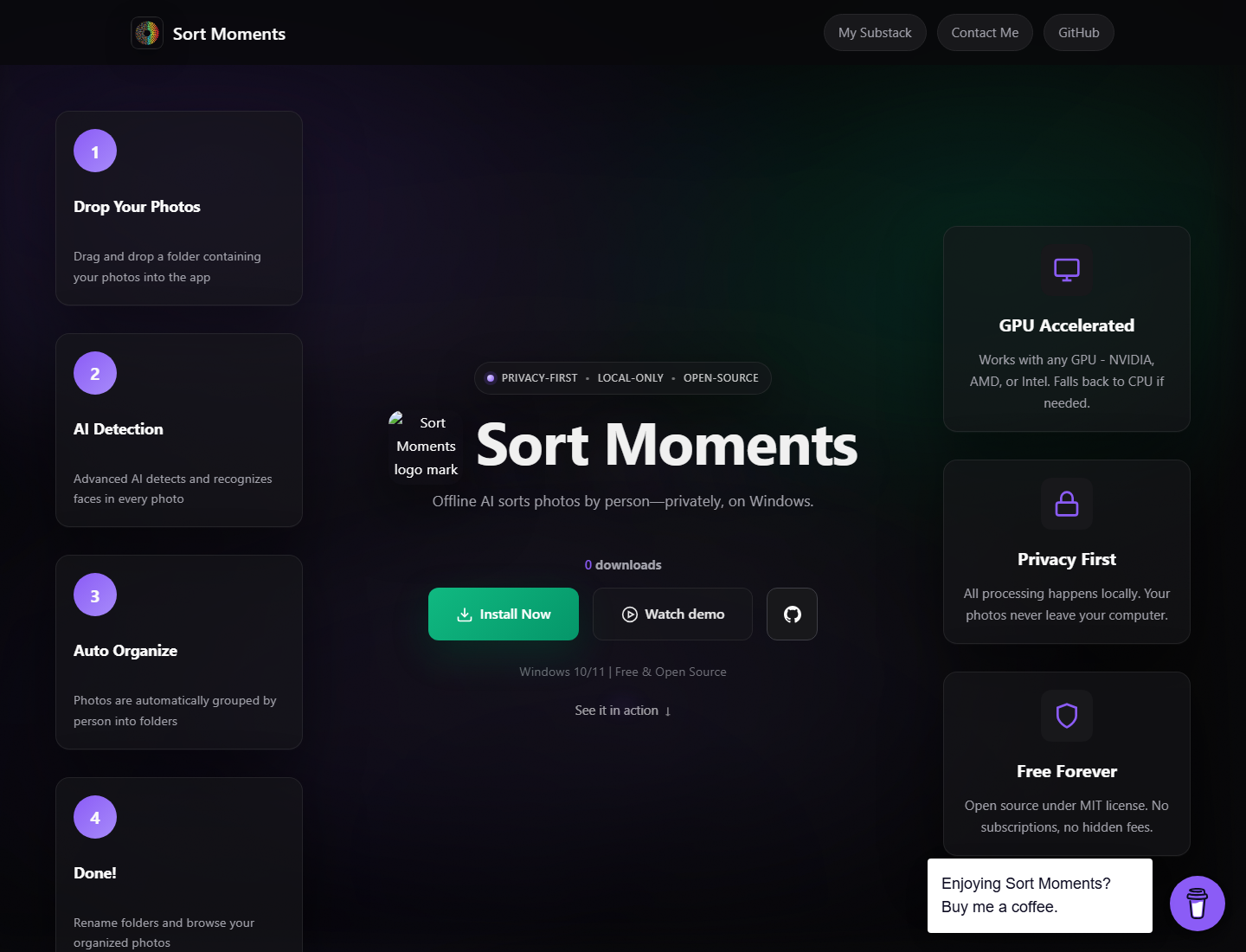
The problem was the outfit. Too much glow. Too many sections acting important. A homepage with the confidence of a launch deck and the restraint of a RGB keyboard.
Why the look was retired
The app did not need a funeral. The website needed a shower.
The new version is quieter: obsidian palette, clearer privacy, real counts, fewer boxes pretending to be strategy. Same product promise. Less homepage theatre.
What stayed the same
Local by default. No signup wall. No cloud middleman. Windows and macOS downloads still point to GitHub Releases. CLI stays available. Python API stays locked until the package is real.
Same Sort Moments. Better clothes. The old clothes are below, preserved for accountability and mild embarrassment.
What it looked like
Want the actual old page?
The first-generation landing page is preserved as a view-only artifact. Click through if you enjoy design archaeology or need proof that taste can, allegedly, improve.